Permissions Dashboard
digital | UI | branding
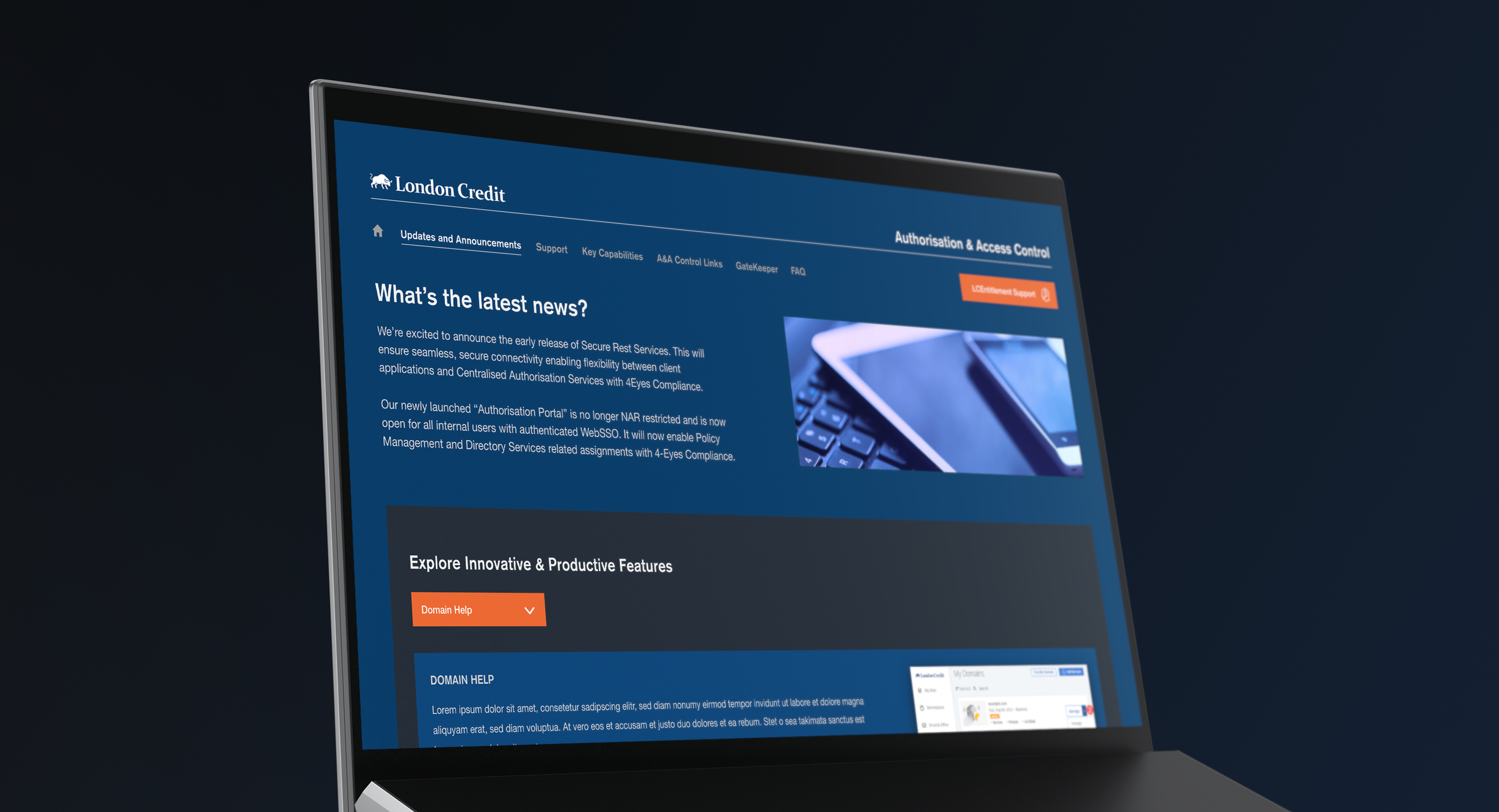
This is a dashboard for a financial services organization where there was a lot of content that needed to go into a single intranet web page. The Product Manager wanted brand colors, stock photography and a dark mode approach.
The first image is what I was given to work with. The second is my solution using brand elements and UI best practices to create a page/flow that is a much better user experience.
I should mention that this was not for London Credit. I had to “debrand” this for public viewing, which is often the case with this kind of work.


